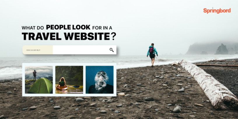
 Read time 2 min
People’s preference in travel is shifting drastically. Travelers are now enthusiastic about new experiences and there is a substantial rise in solo travel. All this is made possible by rapid digitization. Today, people simply jump on to the internet to start planning their international or domestic vacations.
Travel websites and smartphone apps have given unrestrained access to stunning, fascinating and trendy locales and experiences. And people are willing to pay more for unique and memorable experience that is worth the money. While this new traveler behavior is good news for travel websites, if you fail to provide right information at the right time, you may lose your audience to your competition.
That said there is no one-size-fits-all solution to ensuring you have the best experience listing catalog. However, here are some fundamental best practices that you should follow that can help design a great experience catalog and increase your potential for better user engagement.
Be a virtual travel assistant
Travelers, particularly millennials, are increasingly looking for new experiences. That is why travel websites, especially the popular ones, have exhaustive list of experiences besides destinations. In fact, sometimes travelers decide on destination based on the experiences such as hiking, adventure tourism, fishing, food tourism, et al. So, if you wish to inspire your visitors you need to offer information about a wide range of activities that help travelers get to the heart of the local experience.
But, simply listing experiences and activities is not enough. In a marketplace where numerous websites offer the same information, it is crucial to act as personal travel assistant to drive traffic. You need to offer relevant and detailed information about the tours and activities that can simplify the decision-making process and make booking those activities a breeze.
Make it easy to search
Some users may use specific keywords to look for certain activities/tours, while others may just browse through every experience listed on your site. And yet others might filter just a few activities. Different people search for tours and activities in different ways. It is therefore essential that you make the search process easy and intuitive so that your visitors can find what they are looking for. In case they fail to find their preferred activities/tours quickly, they will simply visit another website.
Make sure that your site offers a view of the complete range of experiences listed in a unique way that can cut through the noise. And it is user-friendly enough to help visitors find the experience they are interested in quickly and plan their next trip.
Use stunning images
It is no hidden secret that if a travel website wants to attract visitor and be successful it has to have eye-catching images, graphics and other visual content. Think as a traveler, without relevant and high-quality images to support your tour content it is almost unlikely that you will be able to draw users. This boils down to focusing on improving the overall user experience. Image management therefore plays a key role in inspiring and engaging visitors.
Optimize and update
Creating a travel website that converts is not a one-time process. Data management, content update, image and site optimization, all these processes need to be continually followed in order to ensure your site’s success. Additionally, if you want to stand out and maintain that position you need to ensure you offer a consistent user experience that not only offers great information but is also easy to navigate.
Springbord can help you make your website a go-to destination for users looking for new and exciting experiences and tours. Connect with us to find out about how we can optimize your catalog and drive more traffic.


