 Read time 3 min
In today’s world, data is everywhere, and the real estate industry is no exception. From transactional data to property information, the amount of data available can be overwhelming.
However, data is only as good as the insights it can provide, and that’s where data visualization comes in.
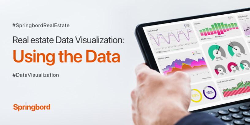
Data visualization is the art of representing data in a visual format, such as charts, graphs, and maps, to help people understand and interpret the data.
In real estate, data visualization is becoming increasingly important for decision-making, as it allows investors, developers, and brokers to make sense of large amounts of data quickly and efficiently.
In this blog post, we will explore how real estate data visualization can help industry professionals make better decisions by understanding the data.
The Benefits of Real Estate Data Visualization
Data visualization can provide many benefits to the real estate industry. A few of the primary advantages are as follows:
- Identify Trends: Real estate data visualization can help identify trends in the market, such as changes in property values, vacancy rates, and rental prices. With this information, industry professionals can make informed decisions about investments, developments, and marketing strategies.
- Compare Data: Visualization allows data from different sources to be compared and analyzed in one place. For example, data on property prices, demographics, and crime rates can be overlaid on a map to identify areas with potential for investment.
- Identify Opportunities: Real estate data visualization can help identify opportunities that may not be apparent in raw data. For example, identifying areas with high rental demand or underdeveloped properties that could be converted into profitable developments.
- Communicate Data: Visualization makes it easier to communicate complex data to stakeholders, including investors, clients, and team members. This can lead to better decision-making, as stakeholders have a clear understanding of the data and its implications.
Examples of Real Estate Data Visualization
Here are some examples of how data visualization is being used in the real estate industry:
- Heat Maps: Heat maps use color coding to show data on a map, such as property values or rental prices. This allows users to quickly identify areas of interest or potential investment.
- Line Charts: Line charts are used to show trends over time, such as changes in property values or rental prices. This can help investors make informed decisions about when to buy or sell properties.
- Bar Charts: Bar charts are used to compare data across different categories, such as property types or locations. This can help investors identify areas with the highest potential for returns.
- Bubble Charts: Bubble charts use circles to represent data, with the size of the circle indicating the magnitude of the data. This can be used to show data on property sales or rental demand.
Real Estate Data Visualization Tools
There are many tools available for real estate data visualization, ranging from simple spreadsheets to complex data visualization software. Some popular tools include:
- Excel: Excel is a powerful tool for data visualization, with many charting and graphing options available.
- Tableau: Tableau is a data visualization software that allows users to create interactive dashboards and charts.
- GIS: Geographic Information Systems (GIS) are used to visualize data on maps, including property values, rental prices, and demographics.
- Power BI: Power BI is a data visualization tool from Microsoft that allows users to create interactive reports and dashboards.
Conclusion
Real estate data visualization is a powerful tool for industry professionals, enabling informed decisions about investments, developments, and marketing strategies.
By identifying trends, comparing data, and effectively communicating insights, real estate experts can gain a competitive advantage.
To ensure the accuracy of the data, Springboard offers a comprehensive real estate data service, while also providing courses and resources to enhance skills in data visualization, empowering professionals to excel in this dynamic field.


